UX Design Project
Date: June 2022
Role: Led as UX Designer in a two person team
Project Goals:
Redesign a facilities page for the E2E website, to address the issues faced by users who use screen readers.
Design the page so that it is easy to find information about different kinds of facilities that can be rented.
Why was it important?
In the first phase of the project, we conducted a study with participants who used screen readers and found the pain points that they encountered. To read more about the study, click here.
In this phase of the project, we redesigned the website’s facilities page to improve its usability and to make it work seamlessly with screen readers.
Here I have shared the design that was favored in the AB testing.
Tools:
Hand sketches
Figma
Adobe Photoshop
Lucid Chart
Weebly
Existing facilities page

Design Process
First Stage: Low fidelity prototypes (Paper Prototypes)
We started by addressing the information hierarchy on the page so that all relevant information about a room would be found together under a Heading which would be the room name. We addressed concern C here.
Since we made each room name a heading, that made them navigable using a keyboard, which is a WCAG 2.2 guideline to make the web page content assessible. This was our solution for concern B.


Second Stage: Medium fidelity prototype ( Tool: Figma )
We started the second iteration of the design by mapping out the rooms on the desktop screen. In this iteration, we have organized all the information under each room’s name. When the user clicks on a room, they get feedback on the purpose of the room (Usability Lab or a Focus Group Room), and the facilities, capacity, and size of the room.


Third Stage: High-fidelity prototype
Tool: Weebly

We solved the concern that users had of not finding facility information, once they had encountered the image, by adding information in the alternative text that the room details are to follow further on the page. Since all the room names are now headings, the page is easily navigable. This assured the users that they would find the information they have come for.
By informing users that the tagged headings called Endeavor, Enterprise etc. are rooms, now there is clarity of what users are about to encounter. They can click on any heading and find detailed information for the said room. We successfully meet the user’s mental model by matching external consistencies.


In this final design iteration, we have all the information about the room in one place, as planned. There are very low chances of any crucial information that is available on the page to be missed.
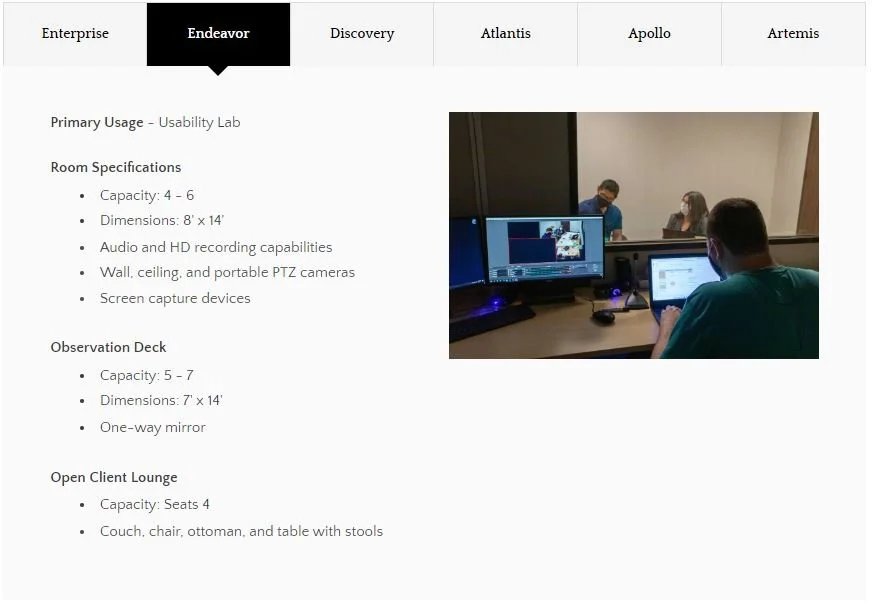

In this design of the webpage, all the room names are tagged as headings, which makes it easily navigable using a keyboard. The layout of each tab lays out the information hierarchy. Users can see the tab headings or they can be read out if using a screen reader, providing clarity of the facility’s options. It is easy for the user to switch between tabs and find the information needed.