Usability Study
Labyrinth Games and Puzzles

About Labyrinth Game Shop
Labyrinth Game and Puzzles are a popular independent store in the Eastern Market neighborhood of DC. They have a loyal clientele and sell analog games. They believe playing games foster communication skills, analytical processing, and creativity. They plan events for community participation and engaging children.
Before the pandemic, they were content with a brick-and-mortar store. Once the pandemic started, things changed for small business owners. When the store closed on March 23, 2020, they started getting hundreds of phone calls from buyers. They had to set up an online shop quickly to cater to the sales. It was a means of keeping all their staff paid. For the scope of our study, we focussed on the online shop.
Our aim was to uncover usability issues of the website and provide recommendations to make it user-friendly for the store’s website users.
Labyrinth’s website: https://store.labyrinthgameshop.com/
My Role
This project was part of a human-centered design course, in graduate school, from January to May 2021. I was part of a two-member researcher team. I planned and conducted research with my teammate using various methods, like contextual inquiry, user interview, task analysis, participatory design, heuristic analysis, think-out aloud method, and A/B testing. This project-based course focused on these various research methods, the metrics they tested, and when to use them.
This project is an exploration of how to conduct a usability study of a website, uncover how users use the website and what could be better for them.
Project Goals
The shop owner had let us know that they wanted to improve the usability of the website. We broke it down to these two major goals.
Improving layout
There was a need to improve the layout for intuitive usage by the user. The homepage was text-heavy, which led many users to abandon their search. We needed to organize the menu items to increase efficiency for a user searching for a product.
Improving navigation
We uncovered some navigation issues on the website. It was not easy to access the blogpost or go to the homepage from the Online Store. We knew, we needed to give the users an option to go back to the home page, which was lacking in the website.
The owner relied on third-party vendors for selling Magic cards and gift cards. On clicking those options, the user would be directed to the third-party website, which would be completely different from the Labyrinth Shop website. We thought the best-case scenario would be to integrate the inventory and sale of Magic cards and gift cards in the website. Yet, we were mindful of the constraints of the business owner in doing that.
Research methods
Contextual Inquiry
Our aim was to observe the participants when they were perusing and shopping for games online, in their natural surroundings (here it was their home). I observed them browsing for games, asked questions to gain insights into the participant’s interactions with websites. I took notes and recorded video meetings with permission. I recapped some insights with them to see if they agreed and get more feedback. It helped me to understand what users are looking for when they look for games online, how do they make decisions, and what helps them to buy a product.
Participants - We recruited participants via peers in class and co-workers. We compensated one participant for their time with a cup of coffee and the other with an appreciation note for their time and insights. There were two participants, one female and one male ranging in age from early thirties to mid-fifties. They were proficient in using technology.
Biases - Since both our participants were proficient in using technology, our results lacked the insights of a novice user.
Observations - Our participants liked the convenience of getting products shipped in a short time. They liked free shipping and if they had to pay, it would help to know the shipping cost upfront on the website. They liked to get together with friends and play games. During the pandemic, they explored two-person games. They liked to browse for games online. But, if they knew the name of the game they wanted to buy, the first preference was to use the search functionality.
User Interview
We wanted to find why people played games, the kind of games they liked, and the times of the day that they played them. We wanted to know what people look for when they go to an online game store. We had questions like - do they find new games? do they use the filters to search for games? or do they look for games that they’ve heard about from friends. We also wanted to find specific usability issues with Labyrinth’s website.
We asked questions during the interview, from the interview protocol, that we used for both the participants. We observed the participants while they were using Labyrinth’s website. We gave them tasks to finish and asked them questions when they finished.
Participants - There were two participants, both males in their thirties. Both the participants are proficient in using technology. They both work in the field of information technology. Participants were direct contacts. We compensated participants with an appreciation of their time and efforts.
Biases - Both our participants were proficient in using technology, so our results lacked the insights of a novice user. As both our participants were male, we attempted to recruit a female participant for removing the bias. But, given the constraints of the COVID-19 pandemic and limited time, we were unable to accomplish that.
Observations - We got to know that our participants liked to play games with friends and family. They looked for deals and were happy to find them in the pre-owned section. It helped if the games store had a return policy they could avail if they did not like a new game. They liked to go through the newsletter to see the products that were being featured.
They found Labyrinth’s website text-heavy and lacking spotlight on crucial information like store hours or location. They had to find out shipping information with some trial and error. They did not find it easy to get back to the homepage from the online store. We found that our participants did not go through the homepage, which had a lot of information.

Notes from interview
User Analysis
Persona building
We gathered information about customers of Labyrinth. We created these personas based on the participants recruited in our previous analysis. We asked Labyrinth store’s owner about her customer’s demographics. Labyrinth store has a Facebook page. We made an inventory of the users who had commented on the posts. These tasks helped us in creating two personas for our project. The personas touched on the pain points experienced by our participants in the interview.
This exercise helped us in putting a face to our users and empathize with their needs and pain points.
Biases - By limiting ourselves to three personas, we did not have a complete representation of the store’s clientele. By gathering user information from Labyrinth’s Facebook page, we based our source on a pool of users who had a Facebook account, followed the store’s page, and were comfortable posting a comment on the forum.

Persona 1- the techie

Persona 2 - the fun aunt

Persona 3 - the gaming pro
Heuristic evaluation
Our team evaluated the user experience of the website and created a usability action report (UAR) for each usability issue. We had twenty distinct UAR’s. After a discussion on the usability issues, we assigned severity ratings to each UAR. We both found different usability problems in the website, which validated the need for few (3-5) experts to conduct Heuristic analysis for the success of this method. We used Jacob Neilson’s ten usability heuristics for conducting a heuristic evaluation for the website.
Limitation - We had a team of two researchers conduct the evaluation. It would be ideal to have at least three researchers working to uncover the usability issues.
Observations - We observed some violations of consistency and standards, user control and freedom, flexibility, and efficiency of use, visibility of system state, and aesthetic and minimal design, error prevention. There are some Web Content Accessibility Guidelines (WCAG) violations. We noted the incident in UAR, which looked like this. I did not have space for noting all the twenty UAR. I am listing 2 of them to show the format and our explanation of the incident, violation of Heuristics and assignment of severity.

Usability Action Report (UAR) 1
Report of the instance of violation of Consistency and Standards and Aesthetic and elegant design.

UAR 6
Report of the instance of violation of Visibility of system state and User control of freedom.
Participatory design
This process aims to hear voices that have, in the traditional sense not had a chance to contribute to the design process - the users. We recruited one participant for a virtual participatory design (PD) session and one for an in-person PD session. Our aim of the session was to identify two different ways to address a usability challenge.
Our aim was to address these four Usability Challenges during the participatory Design session.
● Usability Challenge 1: Poor navigation
● Usability Challenge 2: Poor consistency of layout across different sections of the website
● Usability Challenge 3: Poor Aesthetics and minimal design
● Usability Challenge 4: Error Prevention
Participants - There were three participants.
P1 is a 19 years old male. His ethnicity is African-American. He is a college student and works part-time in retail. He is most interested in video games. He prefers boisterous, extroverted games like Taboo or Pictionary. He buys puzzles for his sister as presents.
P2 is 80 years old female. Her ethnicity is African-American. She is retired. She plays solitaire, both with physical cards and on her home computer. She does buy games and puzzles for her grandchildren, especially puzzles that she thinks are pretty.
P3 is a 37-year-old straight male. His ethnicity is Indo-Aryan. He has professional graduate-level education. He works in the information technology field. He has one child. He likes to play games at the end of the day, to relax and enjoy the thrill of games. He likes the convenience of getting products shipped to his home. During pre-covid days, he liked to go to game stores to see their collection.
The session- We conducted the virtual session using Miro and the in-person PD session using sticky notes, paper, and pen. The virtual session focussed on working on information architecture with users and solving Navigation issues. We used card sorting with two participants on Miro. We created sticky note named after a page from the online store. We made an effort to place the notes as randomly as possible so as not to pre-organize them for the participants. Below is an image of the board.

Whiteboard at the start of virtual participatory design session 1
Task: We asked participants to work together to organize the notes into category groups. They had 25 minutes for the task. Here is the board after the task was finished.

Whiteboard after the participants finished Task 1, in participatory design session 1
Participatory design session 2 was an in-person session, where we had one participant, P3. Our task was to brainstorm two options for a low-fidelity prototype of the homepage and a product page. We aimed to solve two usability issues from the UAR. Our tasks for our participant were:
1. Where would you place the “Online Store” menu on the homepage of Labyrinth's website, that would make it easy to access Labyrinth’s online store?
2. How would you arrange the items on the Homepage that would lead you to do the following:
a) Scan the page for the Online Store button.
b) Arrange textual information on the page that would help you to find important information.
3. How would you arrange the items on the Item listing page that would lead you to do the following:
a) Find important information.
b) You have information that you need to shop for.

In- person Participatory Design session in progress
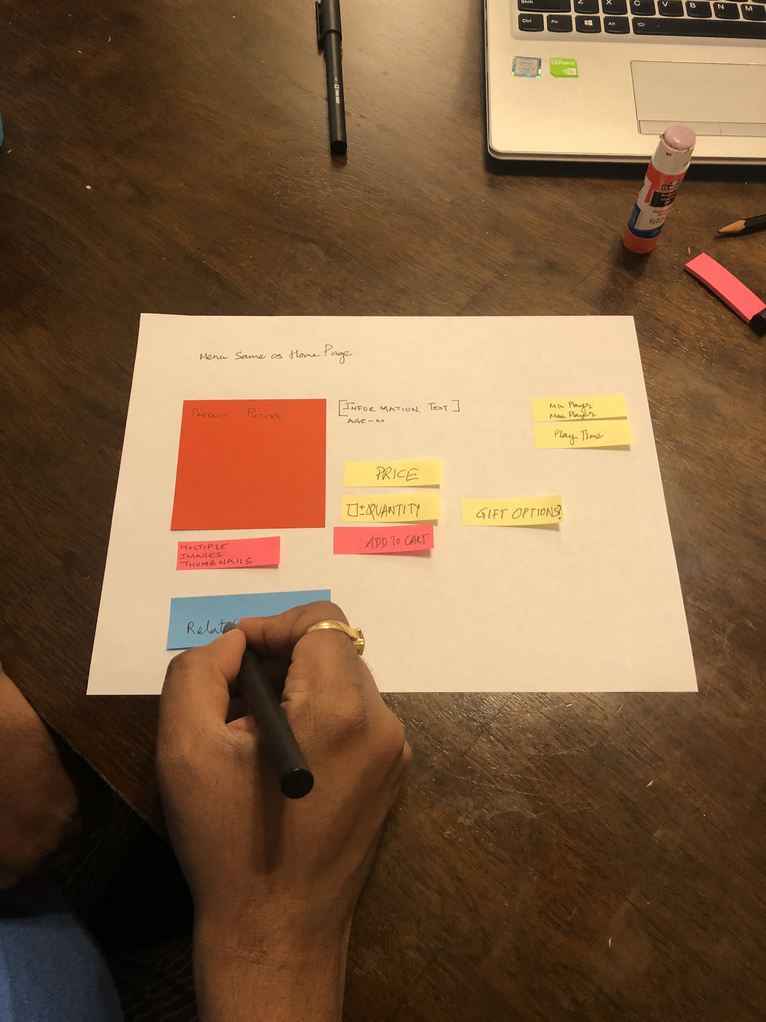
Participant working on design of Product page
Findings
We had our first level and second level menu items from Participatory design session 1. We discussed terminology, like “Personal Shopper” with our participants and received valuable insights. For both of our participants, the term was not clear. To remedy the ambiguity of the term, we considered adding an explanatory blurb, under the term.
We worked on page layout for participatory design session 2. We wanted to work on two wireframe options for two pages in an hour. But, after working on one design each, we were out of time. We did not feel the need to rush to finish the next planned task. Our participant asked us questions and shared his insight on the wireframe of the page. We had worked with our participant in one of the interviews as well, and he thought the Home Page design was text-heavy. During the session, he sought to remedy that problem with his design. As researchers, we felt that having him involved in an earlier study was helpful, as he knew the issues that bothered him and he strived to correct them. The drawback of our session was working with one participant and two researchers. We were mindful of not putting our ideas that might bias him towards them.
User Testing
We developed two options for the homepage, product page, events page, and the online shopping homepage. Each iteration sought to overcome the usability issues.
We tested it with users in two stages. We conducted a Think out aloud session, collected feedback, and iteratively developed the next version of the low fidelity prototype for A/B testing.
Think out Aloud
We wanted to test the options of the wireframes with two users, to find the preferred feature of the users, among the two options.
This method encourages users to speak out loud any thoughts they might have while performing their tasks. They can talk about the layout, features, challenges they faced while finishing the task, or any positive experiences. It is fast and inexpensive compared to large quantitative tests.

Option 1 for Homepage
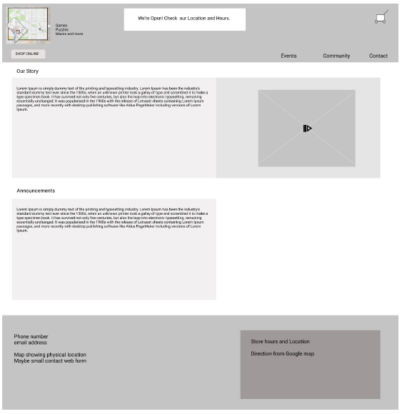
Option 2 for Homepage
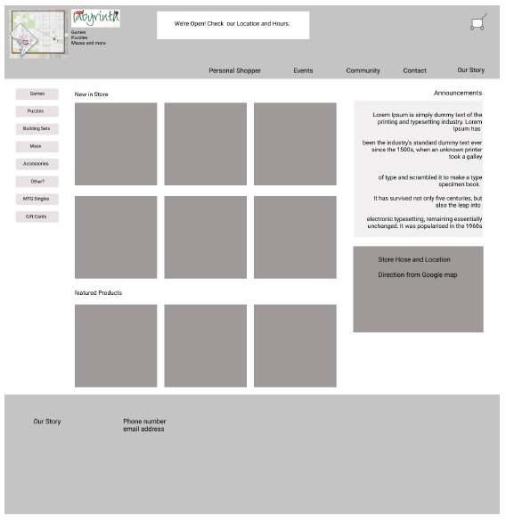
Option 3 for Homepage
Comments from participants
Option 1 for Homepage
The phrase “Personal Shopper” is confusing. Participants didn’t know what “Personal Shopper” means as a menu item. P1 would prefer the word “help” to be included somehow.
P2 Expected a search bar on this page, to search for products
Option 2 for Homepage
Participants did not see the “Shop Online” button, placed under the logo on the top left of the page right away.
P2 did not care for the "our story” section at the top of the page and scrolled away. She said she would never watch the video and read the story. She just wants to buy the game.
Option 3 for Homepage
Both the participants did not like that the announcement section took up the right side of the page. She liked the announcement idea from V1. She felt that she would ignore any text on the right side of the page, as they are generally occupied by advertisements on other websites.
Changes for next iteration
We recommend adding a description to the term “Personal Shopper”. As it would need more space, we would need to move the link to a different place on the screen.
We would add search functionality to the header. It would be consistent across all the pages.
We would discuss the hierarchy of the promotional video on the page.
We recommend making the menu bar pop out instead of receding behind the top header. We can make the text larger for that bar and consistent across all the pages.
We would use the phrase “Community Partnerships” for information about local charities.
A/B testing
We worked on two prototypes for A/B testing. We wanted to test which of these features the users favored.
Homepage original with link to online shopping or online shopping page being the homepage itself.
Personal shopper functionality in the menu or personal shopper term with the description as a prominent link
Events page with a search bar at the top and event filter on the left or events page with search bar close to the calendar.
Original menu to top with filters on the left margin or primary menu categories above the fold on the left margin.

Prototype A Homepage

Prototype B Homepage

Prototype A Events page

Prototype B Events page
We wanted to answer the following questions with this study:
1. Is it intuitive and efficient for users to find the items and events in Prototype A (where the online store is the Homepage)?
2. Is it intuitive and efficient for users to find items and events in Prototype B (where the online store is a link on the Homepage)?
3. Do users have a better idea of what the Personal Shopper service is? Does it help when additional descriptive text is added and its position changed?
4. Are users more likely to use the Event search bar if it is located in the main menu bar where the placement is the same as that for the Product search bar on other pages, or if it is located just above the calendar lower on the screen? Would users use the Events category filter?
5. Are users more likely to use the left-panel category filters if they are located above the fold, while the price and Game Learning filters are below the fold?
Metrics
We aim to collect data for User Satisfaction. We will collect the data through a questionnaire that we will send after the users have finished the tasks. We will ask our participants to rate their preference of the Prototypes based on executing the tasks on a scale of 1-3. 1 being “prefer a little” 2 being ”prefer somewhat” and 3 being “prefer a lot”. We will have a comments input section at the end of the questionnaire asking for “Any other comments?” We will also collect qualitative data from the Think Out Aloud method.
Study Design
We used a variation of the Latin Squares test structure. P1 is participant 1. We had 7 participants for our study.
P1 – Prototype A - Task 1, Task 2; P.S. Question; Prototype B - Task 2, Task 1
P2 – Prototype B - Task 1, Task 2; P.S. Question; Prototype A - Task 2, Task 1
P3 – Prototype A - Task 2, Task 1; P.S. Question; Prototype B - Task 1, Task 2
P4 – Prototype B - Task 2, Task 1; P.S. Question; Prototype A - Task 1, Task 2
P5 – Prototype A - Task 1, Task 2; P.S. Question; Prototype B - Task 2, Task 1
P6 – Prototype B - Task 1, Task 2; P.S. Question; Prototype A - Task 2, Task 1
P7 – Prototype A - Task 2, Task 1; P.S. Question; Prototype B - Task 1, Task 2
We will have a three-section questionnaire. Section 1 of the questionnaire is completed at the mid-point between the user interacting with their first prototype (A or B) and their second prototype (B or A). Section 2 is completed after interacting with the second prototype. Section 3 is completed after Section 2. Although Section 2 and 3 could be merged because 3 follows immediately after 2, separating the sections helps the user separate the questions in their mind. It also helps the researchers separate the data into useful sections in the spreadsheet.
Findings
Prototype A or B - 5 out of 6 participants found it easier to find products in Prototype A.
All the participants found it easier to search for events in Prototype A than Prototype B. All participants found Prototype A to be easy to find the search bar for events.
4 out of 6 participants used the category filters on the left while searching for products.
ll 6 users found the lower search bar position for Events, easier and preferable.
Recommendations
Our A/B test results showed that users did not like to go to the home page and find the online Store link. They wanted to see the online store on the Homepage. We recommend designing the home page such that the online store is available for browsing and the search functionality is visible on the home page itself. There could be links for Community involvement, Events, and Contacts.
Users were able to search for events using the search bar when it was placed close to the calendar and the heading “Events”. The event search bar’s position should be close to the event calendar for a better association of the functionality of searching for events.
A blurb explaining the meaning of Personal Shopper would give insight to the users what the service is about, and help them decide if they want to click on it.
While looking for ways to navigate, we found that the position of category filters above the fold helped our users to use them and made their tasks easier. We would recommend having the category filters above the fold.
Adjust all text and navigation icons to meet AAA standards for normal text according to the WCAG guidelines. Provide contrast by darkening the background color to reach at least a 7:1 ratio to achieve AAA standards for ‘normal text.’
Ensure all filters are usable on small screens/mobile screens. It may require some resizing or redesign of the elements
Learning
While planning research sessions with participants it is important to allow time for each task and account for questions and the decision-making process. It helps to account for some extra time if the participant needs help with equipment or with the medium. We prepared three tasks for our participants, however, could finish two. It was a rich experience than we had anticipated. It is important to be aware of the mood of the group.
Researchers should reiterate that it is the product that is being tested and not the participant. The time requested by the researcher for the test session, should be honored and not extended.
Participants should receive compensation for their time and effort in testing the product. This activity helps us to create a robust product.